Do You Speak Web Design?
Have you ever read a website proposal and felt like it was written in another language? Here are some terms that we use in proposals, meetings with our clients, and discussions about web design that might be new to you.

Digital marketing: An umbrella term for all the ways in which companies and organizations advertise online. It includes websites and web applications, social media, online advertisements on other sites, and online content like articles, images and video.
 Visual web: The use of images and videos to tell a story rather than text. This means that sites with walls of text and lengthy writing turn users away in search of sites with information that is simpler, more graphic, and easier to digest.
 User experience: The way people interact with the site and how well it communicates with users. Is the site well-organized? Does it give feedback? Does it intuitively lead users to the information they need? If the answer to these questions is yes, then user experience is satisfactory.
 Graphic language: The icons, illustrations, hovers, and other visual elements (type, colors, etc.) that create the look and feel of a site, which helps to communicate an organization’s message to its site’s users.
 Information architecture: How a site’s content is laid out based on the user’s needs. According to information architect Peter Morville, “The organization, search, and navigation systems that help people complete tasks, find what they need, and understand what they’ve found.”
 Site navigation: Falls under the umbrella of information architecture. How the user moves through a site’s pages.
 Site map: The visual representation of the information architecture; a layout of the hierarchy of all the pages.
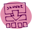
 Call to action: Funnels the user towards the end goal of a site. What do you ultimately want users to do when they access your site–Make a donation? Request more information? Fill out a form? Simple, clear, and easily-accessible calls to action work best.
 Responsive design: Whether or not a site adapts to screens of different sizes. In the age of smartphones, tablets, and laptops, a site needs to be readable and easy to navigate on screens of various sizes.
 Wireframe: The layout of a site’s pages without the design. Content is broken down into boxes to show where things like images, text, sliders, and video will go to provide a general idea of how the user will flow through it.

Design layout: Synonyms: Mockups, comps, screen concepts, PSDs. Shows how the pages on the site will look when the site is finished.
For more information on basic terms in web development, check our two-part post on Web Development for Smarties.
 Fort Ligonier Days: 60th Anniversary
  JCC PGH: Center for Loving Kindness
  Wagner Agency
  OBID: You Are Here
  Breathe Project
  Back and Better Than Ever! What's the Point .5k registration is OPEN!
  Celebrating Farm Appreciation with Blackberry Meadows Farm
  Celebrate Community Cultivation During National Farmers Market Week!
Be the first to comment!