Getting Organized: Wide vs. Deep Websites
First, let’s talk business.
Creating a hierarchy can be a great way to organize both people and information. Companies, for example, can be organized vertically or horizontally. A vertical (or “deep”) company has a CEO at the top who delegates tasks to managers down the chain of command. These companies tend to be bigger organizations that depend upon an established hierarchy to function efficiently.
 A horizontal (or “wide”) structure diminishes this hierarchy. Tasks are shared by equals, and power is distributed more evenly throughout the organization.
These two approaches also work when it comes to organizing content on a website.
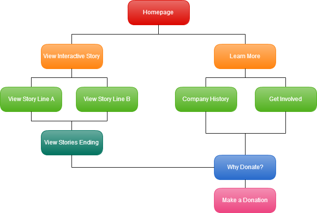
On a deep website, the site navigation leads users to information through a multistep process. A deep website has one or two points to make–or calls to action–and users visit the site looking for those specific things. For example, think about a charity whose website provides information about the charity and enables users to donate. Users visit the website to do one of two things: learn more about the charity or donate to the charity.
A deep structure is effective when there is a logical order to progressing through the information on a site. In the charity example, users can learn about the charity and then donate. Deep sites are good storytellers–if you want readers to have certain information before reaching your site’s call to action, a deep site might be the right kind for you.
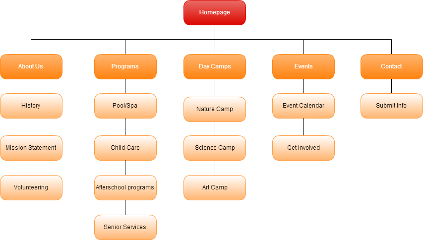
A wide structure, on the other hand, works well for websites that have many calls to action or that attract users who are looking for many different things. For example, a community center like the JCC Pittsburgh that offers after school programs, exercise classes, gym membership, summer camps and other services benefits from a wide website. These sites offer many pages with different topics so that diverse users can easily find the information they need.

This deep website only offers two choices from the homepage. These choices lead the user through a logical progression of information that leads to the call to action.

This wide website offers many options on the homepage that take users to different pages that have the information users need.
What does this look like in practice?
For an example of an effective horizontally-organized website, visit our homepage at firemancreative.com. There are four categories at the top of the page because users visit our site for four reasons: to view our portfolio, learn about our team, read our blog or find our contact information. These categories cater to users looking for different information.
To see a great deep website, check out this Mercedes Benz site. Users can either scroll through the interactive story told on the site or get more information on the car being advertised. The information at the bottom of the page makes no sense without seeing the entire progression, and deep organization creates a logical order to finding the information. At the end of the story, there is a call to action to learn more about the car being advertised.
Now that your website is organized, check out our post on rules to write by on the web!
 Fort Ligonier Days: 60th Anniversary
  JCC PGH: Center for Loving Kindness
  Wagner Agency
  OBID: You Are Here
  Breathe Project
Be the first to comment!