Graphic Design and the 2016 Election
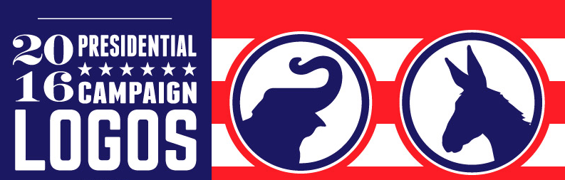
There’s still over 500 days until the 2016 presidential election, but the field is already getting a little overcrowded with candidates. So far there are 12 Republicans and 4 Democrats seeking their party’s nomination and ultimately the presidency.
With each candidate comes the much debated campaign logo that will be used on buses, shirts, stickers and signs for months to come. A good logo can project all sorts of perceptions about your business or personal brand. It can make you appear approachable, fun, youthful, strong, or hopefully in this case — presidential. A brand and its logo can directly influence our impressions of that company or candidate. Businesses and politicians aren’t that different — they’re both selling something, in this case it’s their vision of America and the future. These logos play a crucial role in the promotion of a candidate their campaign strategy.
Fireman Creative’s graphic designers, Nate Taylor and Clarissa Bock, had some thoughts about some of the campaign logos we’ve seen so far. From Hillary and Carly to Jeb and Marco, here’s what our designers had to say…
FC: Let’s start with the presumed front runners on both sides — Hillary Clinton and Jeb Bush.
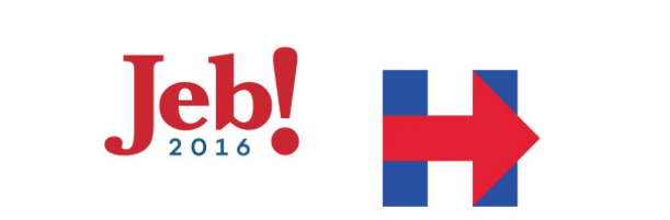
Nate: Coupling the goofy name “Jeb” with an exclamation point makes this feel like a new puppet show for children’s television. I’d watch Jeb. He probably plays the banjo. Another thing that’s coming into play is the use of a font with heavier serifs, something we call a slab serif. You don’t see slab serifs that often. Hardly presidential.
Clarissa: This logo looks very similar to the design that Bush used when he was elected governor of Florida in 1998. One major improvement is the typeface. Although, I would argue with Nate that this is not a slab serif. Baskerville – the font used- is a typeface that is known to make us more likely believe what we are reading. The part that makes this logo fall apart is the sans-serif “2016” below. It’s a very weak mix that looks like it doesn’t belong.
Nate: More than anything else, I wish I knew the reasoning behind the exclamation point. What does it mean? Is it a surprise? Does Jeb have surprises for us? Will he be surprised if he gets nominated?
Clarissa: The in-your-face exclamation point reminds me of Yahoo! or ChipsAhoy! These companies use it to show that they’re friendly and open to everyone. It seems forced on this logo, as if Jeb wants to force himself to be our friend. Maybe he should have tried out “Jeb?”
Nate: For Hillary’s, I like the idea but this logo feels a little half-baked. I’m sure they were shooting for simplicity, but the combination of severely basic colors with preschool shapes leaves me asking: “is that it?” Also, it has fundamental design problems. When you put two colors that are equally vibrant next to each other, the edges vibrate and appear to have a dark region at their edges. We call this effect simultaneous contrast, and it’s usually avoided because it looks messy and can be distracting.
Clarissa: I see what she was going for here — an arrow moving forward — action, progress but it looks like it was made in Microsoft paint. That thought aside, I think the way she uses this logo as a framework is smart. It is recognizable no matter what colors she uses. Due to its simplicity, it is very adaptable.
Nate: All in all, it looks as if it was made by a student, for their uncle’s shipping company. Hopefully the logo doesn’t have a negative impact on Hillary’s campaign. But at the very least, she should be able to beat out UPS.
FC: Let’s move on to Marco Rubio. His campaign logo got a lot of backlash when he announced he was running back in April. A lot of people pointed out that the U.S. map above the “i” was missing Hawaii and Alaska. That obvious, glaring error aside, what do you guys think of this one?
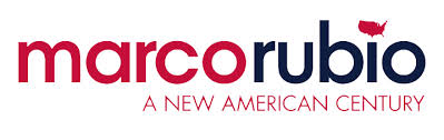
Clarissa: While Jeb’s exclamation point balances out the letters, Marco Rubio’s map feels like an afterthought. He manages to reduce the entire country to a tiny little whale dotting the “i.” Looks like he isn’t interested in Alaska and Hawaii’s vote.
Nate: I don’t hate this logo. Putting everything in small caps makes it approachable. But if I did hate this logo, I know what the reason would be — how is that tiny America supposed to reduce for print? If you put it on letterhead, it’s going to look like somebody popped a zit on it. It looks like a mistake.
Clarissa: The lowercase sans serif is very approachable with the audience he seems to be appealing to with his tagline. It feels very modern and that he is not stuck in the past.
Nate: This issue of reduction for print also comes up with the subhead. “A New American Century” isn’t going to get much smaller before it becomes difficult to read, especially on a billboard. This logo isn’t brilliant, but it isn’t bad either.
FC: Let’s look at Rand Paul’s now. More like Ayn Rand Paul…
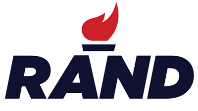
Nate: This is not a presidential candidate. This is a brand of flashlight. The slanted, bold type with a simplistic graphic is very 80’s. Graphics like that flame were “hip jive” in the 80’s, because not everyone could render clean, geometric shapes.
Clarissa: I think Rand got his inspiration from Tinder. The flame is bland. Ditch the torch. The white space that closes the torch between the “A” and the “N” is clever but I think most people pass over this. Instead, the dash looks more like it should be an accent mark.
Nate: And our intern Eric thought it was a gas company at first glance. This logo could really be for anything, but it’s certainly not for a presidential campaign.
Clarissa: I agree with Eric, it looks like a corporation not a candidate.
FC: How about Hillary’s competition in the party — the second Democratic candidate to announce his bid, Bernie Sanders?
![]()
Nate: Not bad, Bernie. The more I look at this logo, the more I like it. There are quite a few little things going on: the “r” suggestively tucking itself into the “n,” the little star twinkling over the “i,” and the toothpaste wave gently lapping at the baseline.
Clarissa: I would definitely buy this toothpaste. I hope my teeth are as white as Bernie’s hair.
Nate: For me, this logo evokes “sea to shining sea” imagery with its waves. Very nice. The only thing I might change would be to remove one of the special elements, whether it’s the toothpaste, the star, or that sensuous, curly “r.” All of them together seem like a bit much.
FC: Let’s look at one more Republican candidate … Donald Trump Carly Fiorina.
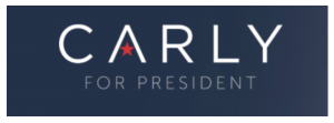
Clarissa: At a first glance I like this logo. But it doesn’t really have anywhere to go. It’s just gotham light text scaled down — which makes it extremely illegible at smaller sizes. It seems that the “A” with the star could convert down to a smaller logo but this has nothing to do with her name.
Nate: The best so far. It’s nuanced, but not on a Bernie Sanders level. It’s simple, but it doesn’t fall off the Hillary Clinton Cliff of Simplicity. The colors are subdued and professional. The type is easy to read and gets the message across. The star is a nice touch. I think female candidates sometimes have to fight the expectation that they will be stereotypically soft or yielding. The font is a no-nonsense sans-serif, with lots of space between the letters — what we call “tracking.” The typeface is very professional. And on a slate-blue background, it’s presidential.
Clarissa: She needs her last name. Carly sounds like a little girl that is running for president at her middle school. Although it makes sense for Jeb and Hillary, Carly should not have followed their lead.
FC: Thanks guys. We only got to 4 of the 12 Republican candidates and 2 of the 4 Democrats — we’ll have to save the rest of the clowns in the clown car for another day.
 Fort Ligonier Days: 60th Anniversary
  JCC PGH: Center for Loving Kindness
  Wagner Agency
  OBID: You Are Here
  Breathe Project
Be the first to comment!